Product-Led Onboarding: Why Onboarding is important for PLG
Product-Led Onboarding: Why Onboarding is important for PLG
Product-Led Onboarding: Why Onboarding is important for PLG
Why onboarding is critical for user success at product-led growth companies
Why onboarding is critical for user success at product-led growth companies
Why onboarding is critical for user success at product-led growth companies


Introduction
It is often said - to understand someone's worth, take a look at their shoes.
In our daily lives, first impressions are crucial for developing relationships, getting new business, or even buying a new car. So much so, that con-men use appearances to fool even reputed businessmen into swindles, by making their first appearance an impactful one. Whether in love, business, social relationships, everyday living, or shopping - each of us strives to put our best foot forward, to make the best impression we can.
For years, however, our software chose to ignore first impressions. Those of us who remember the 1,500-page manuals that would accompany most software purchases will know what I mean - user interfaces slapped on to command-line interfaces in a slapdash manner (Windows 3.1, anyone?), 36-step processes for doing basic tasks (each ERP has its own double-digit number, to be honest) - design, ease of use, ergonomics, guiding users and usage driven through intuition were never a focus of software development.
Until the release of Windows 95 and MacOS. And we know how that story panned out.
PLG Onboarding: A critical component for PLG success
Fast forward to today, then. Increasingly, software companies have chosen to adopt better design as part of their product development planning. Still, however, most legacy companies generally have a separate business model dedicated to user training for their software, often charging hundreds of thousands of dollars to enable employees of their customers (or even their own direct customers) to gainfully use their software.
PLG companies, however, don’t have this luxury. Since products from PLG firms are expected to first bring customers in (instead of the traditional software purchase model, where purchase happens first and users start using later), ease of use, intuitive guidance, and frictionless user onboarding are non-negotiable components of product design, as well as of the product onboarding experience.
From the minute a user creates an account (increasingly, not even an account - use their Google, or Microsoft, credentials to log in - the flow begins with single-sign-on support), the user has begun evaluating whether they can derive value from your product. According to Ramli John, author of “Product Led Onboarding”, product-led onboarding is the crux of the product-led strategy - fail here, and the entire PLG effort will fail at the customer acquisition stage. To get an idea of the number of instances when a user may leave your platform even before they begin using it, take a look below -
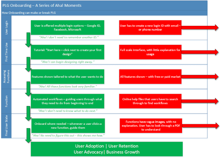
In these flows, only one of the two leads the user towards adoption, retention, and advocacy. Simply put, onboarding is the process of bringing a user to true adoption.
At the same time, it is also obvious that user onboarding can be a road full of holes through which users (and revenues) can slip through as well. Each step at which added friction can cause the user to move out of the onboarding flow (and hence, on to another one that has a better flow than yours) will cause an incremental amount of lost revenue. For SaaS, especially, without a purchase buy-in, leading users through to retention is a critical determinant of success. But how do you lead them without involving the cardinal sin of customer-centricity - friction?
Can friction be good?
Traditional wisdom says friction in any customer-facing tool is a no-no. “Get the user to what they need in as few steps as possible” is conventional wisdom. But often, this gets misunderstood.
No, dumping the user into a user interface with 15 menus and 20 odd icons whose function isn’t explained isn’t a single step.
Here’s where the concept of good friction in an onboarding flow comes in. Friction can be a good thing when it achieves one of three things -
Directs users to the next step in the onboarding process.
Adds to and personalizes the user onboarding experience.
Delights users and gets them excited about the product. (creates an “Aha” moment)
Here’s an example from Gmail, when they onboard a new user -
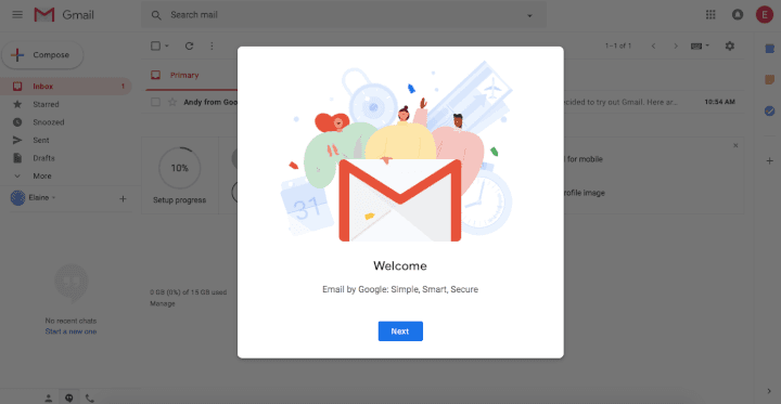
Upfront, this looks like a point of friction. Get me to my email already!
But on taking a closer look, here’s why this makes sense
When a user creates an email account, it is often to provide it in a form somewhere. They aren’t looking to explore the webmail interface
When a user views a new UI, they need to understand how to complete the basic tasks. Gmail’s guided walkthrough does a fantastic job of it.
Onboarding does not end at the first step. As users explore new features, they trigger more onboarding walkthroughs.
Eventually, Gmail becomes so easy to use, even most corporate users don’t go back to their Outlook email clients.
Onboarding methods
Onboarding methods can take a variety of shapes, depending on the audience, the tool, or the usage context. Consider the following scenarios:
If the tool is complex, a guided walkthrough may become too tedious (36 steps?!). In such cases, easy access to a downloadable walkthrough guide may work better.
If your primary user is a design newbie who wants to quickly put together a poster, pointing them to a clean slate may not be the right way to go. Maybe show a list of templates.
If your user clicks on the Settings icon after hiding a series of posts on their social media feed, it is very likely they are looking to tighten their privacy settings.
Keeping track of user behavior can be critical to effective onboarding. Here’s some of the key onboarding methods that are in use today -
Guided Onboarding - Pop-up tutorials, bots, wizards, persona linked intros, progress bars, template galleries
User Welcome - Video tutorials, Intro videos from founders, product tours
Purpose-driven onboarding (typically triggered by particular user actions) - Chat windows, tooltips, how-tos, progress bars, in-app tutorials
Self-service onboarding - Automated knowledge bases, tutorials, and free certification programs
Many more exist. PLG companies today are very creative with their onboarding - surprise and delight are always a great part of any user experience.
What can a good onboarding flow help achieve?
Onboarding can improve user experiences, create a more sticky product that users keep coming back to - and most importantly, drive revenues. Being proactive about onboarding, and identifying the steps where onboarding is failing, is a critical determinant of company success.
Snappa, a SaaS quick design tool, noticed that 27% of users never activated their accounts by clicking on the confirmation email. By eliminating the confirmation step, Snappa added 20% to their monthly recurring revenues.
(There is a flip side to consider, however. Removing the confirmation step could mean a large number of fake/inactive accounts created with temporary email IDs, junking up the user database that would need constant cleanup. )
86% of users say they would be more likely to stay loyal to a business that invests in onboarding content.
Your onboarding workflows can make or break your business. Here are a few great onboarding flows for inspiration:
Figma
Figma's onboarding flow makes extensive use of modal windows to guide the user through what can be, at first sight, an intimidating interface. As a multi-faceted, feature-rich tool, Figma risks losing users at first touch when they see the product in its entirety.
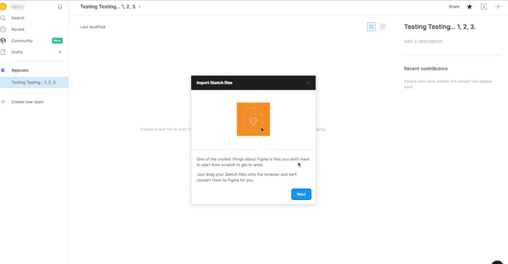
Figma makes very clever use of model windows to hide that complexity. In this first screenshot, Figma uses a modal window to acknowledge that they are different from other design tools, but want to show the user exactly how -
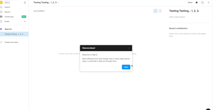
Converting formats? Isn't a problem - in fact, it is one of the first items Figma shows you how to do. In turn, it solves the first problem a user faces - of porting their work from one platform to another.
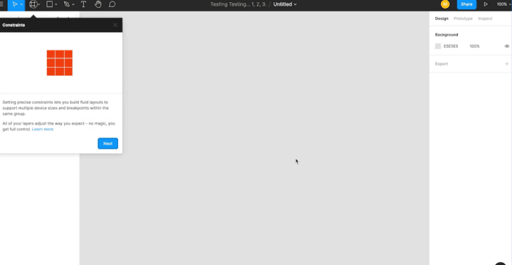
Formatting the screen to fit the format you are trying to build for can be hard to figure out - Figma understands this, setting it up as the next workflow step -
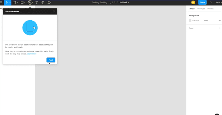
"Vector networks" can be a scary term for a tool. Through an intuitive tooltip, complete with an image illustrating usage, Figma makes this tool very easy to use.
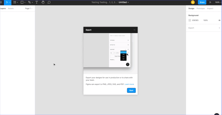
Finally, once done, Figma allows users to export their work into multiple formats for sharing - a guided workflow using modals, from beginning to end.
Speeko
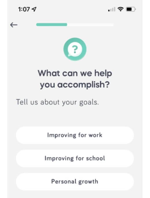
A public speaking app, Speeko's user interface is driven by persona-linked questions. These questions tailor the experience for individual users, enabling a clean interface -
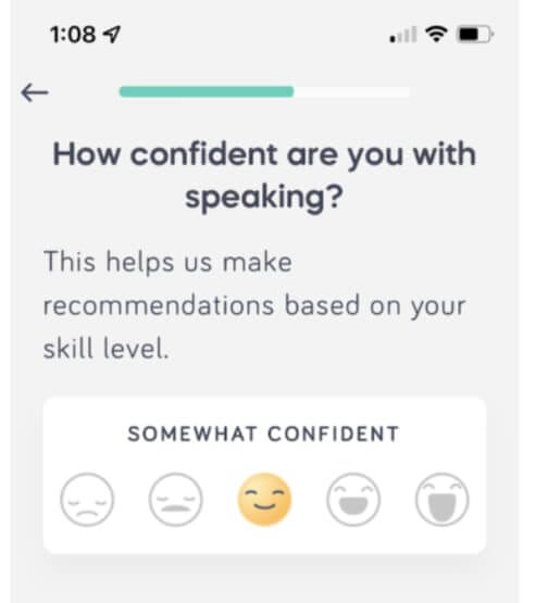
Step by step, the Speeko app builds an accurate profile, creating the right training plan that will -
Ensure the user sticks with it
Ensure progress at a reasonable pace
Removes extraneous content
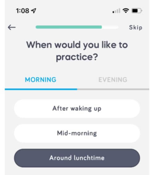
The app not only plans training schedules but also determines its content based on the user's goals
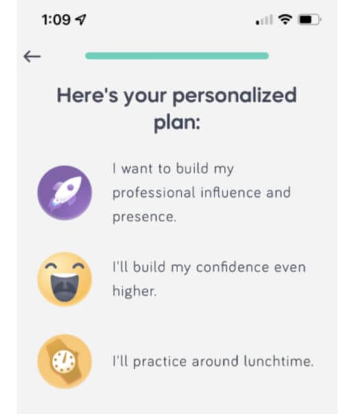
Eventually, it will put together a personalized plan for you that cuts out the fluff.
Grammarly
Who needs help with their grammar, when you have Microsoft Word around to help make corrections? Turns out, quite a lot of people - over 20 million, in fact. What makes a product that provides such a basic function so sticky, and so usable?
Bet you got it right, first guess. The onboarding flows.
The most brilliant part of Grammarly’s onboarding flow is their demo document. As soon as you sign up, Grammarly doesn’t wait until you have a document to edit or write to introduce you to its feature set. The tailor-made demo document guides you through all the features step by step - so that by the time you are done editing, you’re raring to go with your own document.
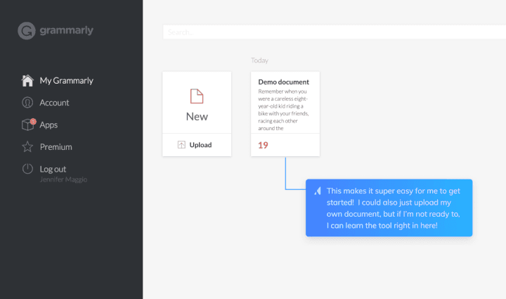
The demo document shows up right next to the option to upload your own file - where the tooltips (shown here as well) will still guide you.
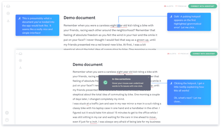
Through pulsing hotspots, Grammarly makes it easy to see spots that indicate new features to explore. On clicking, a tooltip that explains the feature pops up.
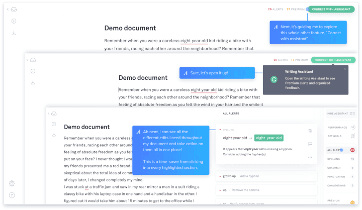
The hotspots, tips, and features are also mapped sequentially. Once the spelling error is seen, the Writing Assistant pops up with a suggestion for fixing the error. All the user has to do to complete the edit is click on the assistant. Voila! Easy-peasy editing. Who wants red lines and right clicks for corrections anymore?
To make the right impression, get the right shoes
When dressing up to step out, shoes can often be the most underrated part of your appearance. After all, who would come and look down at my shoes when I’m talking to them?
But then, the shoes are the first item of clothing they see when you walk up to them... which is why shoes are the most important part of a person’s attire.
In just the same way - onboarding may be peripheral to your product. You may have the best product in the market, but you’ll never get the users and revenues flowing until you are able to ‘get close’ to them. User onboarding is critical to SaaS success, and as more and more tools emerge with better onboarding workflows, continuous improvements and keeping current with new onboarding formats is the name of the game.
Introduction
It is often said - to understand someone's worth, take a look at their shoes.
In our daily lives, first impressions are crucial for developing relationships, getting new business, or even buying a new car. So much so, that con-men use appearances to fool even reputed businessmen into swindles, by making their first appearance an impactful one. Whether in love, business, social relationships, everyday living, or shopping - each of us strives to put our best foot forward, to make the best impression we can.
For years, however, our software chose to ignore first impressions. Those of us who remember the 1,500-page manuals that would accompany most software purchases will know what I mean - user interfaces slapped on to command-line interfaces in a slapdash manner (Windows 3.1, anyone?), 36-step processes for doing basic tasks (each ERP has its own double-digit number, to be honest) - design, ease of use, ergonomics, guiding users and usage driven through intuition were never a focus of software development.
Until the release of Windows 95 and MacOS. And we know how that story panned out.
PLG Onboarding: A critical component for PLG success
Fast forward to today, then. Increasingly, software companies have chosen to adopt better design as part of their product development planning. Still, however, most legacy companies generally have a separate business model dedicated to user training for their software, often charging hundreds of thousands of dollars to enable employees of their customers (or even their own direct customers) to gainfully use their software.
PLG companies, however, don’t have this luxury. Since products from PLG firms are expected to first bring customers in (instead of the traditional software purchase model, where purchase happens first and users start using later), ease of use, intuitive guidance, and frictionless user onboarding are non-negotiable components of product design, as well as of the product onboarding experience.
From the minute a user creates an account (increasingly, not even an account - use their Google, or Microsoft, credentials to log in - the flow begins with single-sign-on support), the user has begun evaluating whether they can derive value from your product. According to Ramli John, author of “Product Led Onboarding”, product-led onboarding is the crux of the product-led strategy - fail here, and the entire PLG effort will fail at the customer acquisition stage. To get an idea of the number of instances when a user may leave your platform even before they begin using it, take a look below -

In these flows, only one of the two leads the user towards adoption, retention, and advocacy. Simply put, onboarding is the process of bringing a user to true adoption.
At the same time, it is also obvious that user onboarding can be a road full of holes through which users (and revenues) can slip through as well. Each step at which added friction can cause the user to move out of the onboarding flow (and hence, on to another one that has a better flow than yours) will cause an incremental amount of lost revenue. For SaaS, especially, without a purchase buy-in, leading users through to retention is a critical determinant of success. But how do you lead them without involving the cardinal sin of customer-centricity - friction?
Can friction be good?
Traditional wisdom says friction in any customer-facing tool is a no-no. “Get the user to what they need in as few steps as possible” is conventional wisdom. But often, this gets misunderstood.
No, dumping the user into a user interface with 15 menus and 20 odd icons whose function isn’t explained isn’t a single step.
Here’s where the concept of good friction in an onboarding flow comes in. Friction can be a good thing when it achieves one of three things -
Directs users to the next step in the onboarding process.
Adds to and personalizes the user onboarding experience.
Delights users and gets them excited about the product. (creates an “Aha” moment)
Here’s an example from Gmail, when they onboard a new user -

Upfront, this looks like a point of friction. Get me to my email already!
But on taking a closer look, here’s why this makes sense
When a user creates an email account, it is often to provide it in a form somewhere. They aren’t looking to explore the webmail interface
When a user views a new UI, they need to understand how to complete the basic tasks. Gmail’s guided walkthrough does a fantastic job of it.
Onboarding does not end at the first step. As users explore new features, they trigger more onboarding walkthroughs.
Eventually, Gmail becomes so easy to use, even most corporate users don’t go back to their Outlook email clients.
Onboarding methods
Onboarding methods can take a variety of shapes, depending on the audience, the tool, or the usage context. Consider the following scenarios:
If the tool is complex, a guided walkthrough may become too tedious (36 steps?!). In such cases, easy access to a downloadable walkthrough guide may work better.
If your primary user is a design newbie who wants to quickly put together a poster, pointing them to a clean slate may not be the right way to go. Maybe show a list of templates.
If your user clicks on the Settings icon after hiding a series of posts on their social media feed, it is very likely they are looking to tighten their privacy settings.
Keeping track of user behavior can be critical to effective onboarding. Here’s some of the key onboarding methods that are in use today -
Guided Onboarding - Pop-up tutorials, bots, wizards, persona linked intros, progress bars, template galleries
User Welcome - Video tutorials, Intro videos from founders, product tours
Purpose-driven onboarding (typically triggered by particular user actions) - Chat windows, tooltips, how-tos, progress bars, in-app tutorials
Self-service onboarding - Automated knowledge bases, tutorials, and free certification programs
Many more exist. PLG companies today are very creative with their onboarding - surprise and delight are always a great part of any user experience.
What can a good onboarding flow help achieve?
Onboarding can improve user experiences, create a more sticky product that users keep coming back to - and most importantly, drive revenues. Being proactive about onboarding, and identifying the steps where onboarding is failing, is a critical determinant of company success.
Snappa, a SaaS quick design tool, noticed that 27% of users never activated their accounts by clicking on the confirmation email. By eliminating the confirmation step, Snappa added 20% to their monthly recurring revenues.
(There is a flip side to consider, however. Removing the confirmation step could mean a large number of fake/inactive accounts created with temporary email IDs, junking up the user database that would need constant cleanup. )
86% of users say they would be more likely to stay loyal to a business that invests in onboarding content.
Your onboarding workflows can make or break your business. Here are a few great onboarding flows for inspiration:
Figma
Figma's onboarding flow makes extensive use of modal windows to guide the user through what can be, at first sight, an intimidating interface. As a multi-faceted, feature-rich tool, Figma risks losing users at first touch when they see the product in its entirety.
Figma makes very clever use of model windows to hide that complexity. In this first screenshot, Figma uses a modal window to acknowledge that they are different from other design tools, but want to show the user exactly how -

Converting formats? Isn't a problem - in fact, it is one of the first items Figma shows you how to do. In turn, it solves the first problem a user faces - of porting their work from one platform to another.

Formatting the screen to fit the format you are trying to build for can be hard to figure out - Figma understands this, setting it up as the next workflow step -

"Vector networks" can be a scary term for a tool. Through an intuitive tooltip, complete with an image illustrating usage, Figma makes this tool very easy to use.

Finally, once done, Figma allows users to export their work into multiple formats for sharing - a guided workflow using modals, from beginning to end.

Speeko
A public speaking app, Speeko's user interface is driven by persona-linked questions. These questions tailor the experience for individual users, enabling a clean interface -

Step by step, the Speeko app builds an accurate profile, creating the right training plan that will -
Ensure the user sticks with it
Ensure progress at a reasonable pace
Removes extraneous content

The app not only plans training schedules but also determines its content based on the user's goals

Eventually, it will put together a personalized plan for you that cuts out the fluff.

Grammarly
Who needs help with their grammar, when you have Microsoft Word around to help make corrections? Turns out, quite a lot of people - over 20 million, in fact. What makes a product that provides such a basic function so sticky, and so usable?
Bet you got it right, first guess. The onboarding flows.
The most brilliant part of Grammarly’s onboarding flow is their demo document. As soon as you sign up, Grammarly doesn’t wait until you have a document to edit or write to introduce you to its feature set. The tailor-made demo document guides you through all the features step by step - so that by the time you are done editing, you’re raring to go with your own document.

The demo document shows up right next to the option to upload your own file - where the tooltips (shown here as well) will still guide you.

Through pulsing hotspots, Grammarly makes it easy to see spots that indicate new features to explore. On clicking, a tooltip that explains the feature pops up.

The hotspots, tips, and features are also mapped sequentially. Once the spelling error is seen, the Writing Assistant pops up with a suggestion for fixing the error. All the user has to do to complete the edit is click on the assistant. Voila! Easy-peasy editing. Who wants red lines and right clicks for corrections anymore?
To make the right impression, get the right shoes
When dressing up to step out, shoes can often be the most underrated part of your appearance. After all, who would come and look down at my shoes when I’m talking to them?
But then, the shoes are the first item of clothing they see when you walk up to them... which is why shoes are the most important part of a person’s attire.
In just the same way - onboarding may be peripheral to your product. You may have the best product in the market, but you’ll never get the users and revenues flowing until you are able to ‘get close’ to them. User onboarding is critical to SaaS success, and as more and more tools emerge with better onboarding workflows, continuous improvements and keeping current with new onboarding formats is the name of the game.
Related Articles


Behavioral Retargeting: A Game-Changer in the Cookieless Era
Unlock the power of behavioral retargeting for the cookieless future! Learn how it personalizes ads & boosts conversions. #behavioralretargeting


All of Toplyne's 40+ Badges in the G2 Spring Reports
Our customers awarded us 40+ badges in G2's Summer Report 2024.


Unlocking the Full Potential of Google PMax Campaigns: Mastering Audience Selection to Double Your ROAS
Copyright © Toplyne Labs PTE Ltd. 2024
Copyright © Toplyne Labs PTE Ltd. 2024
Copyright © Toplyne Labs PTE Ltd. 2024
Copyright © Toplyne Labs PTE Ltd. 2024